
Philly Locals
A community-powered local guide, by locals, for visitors who want more than Center City.
design process
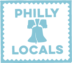
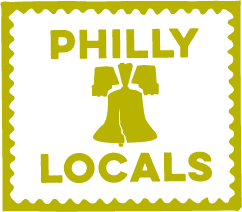
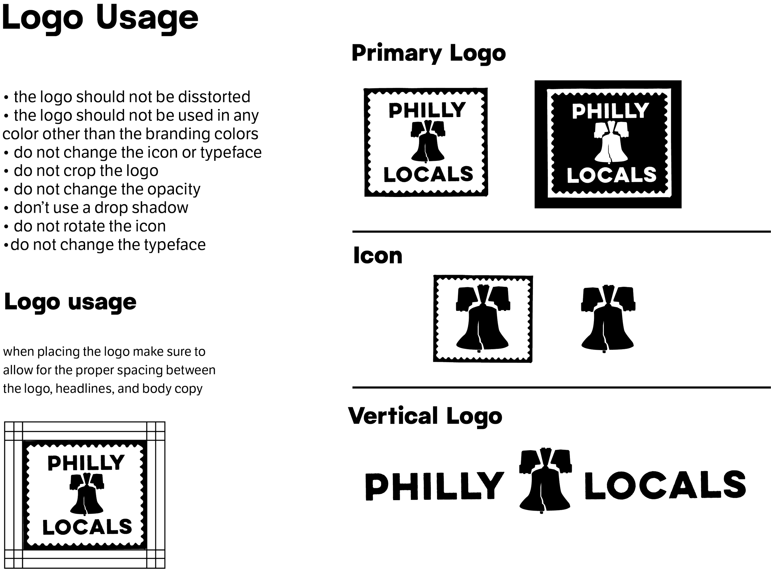
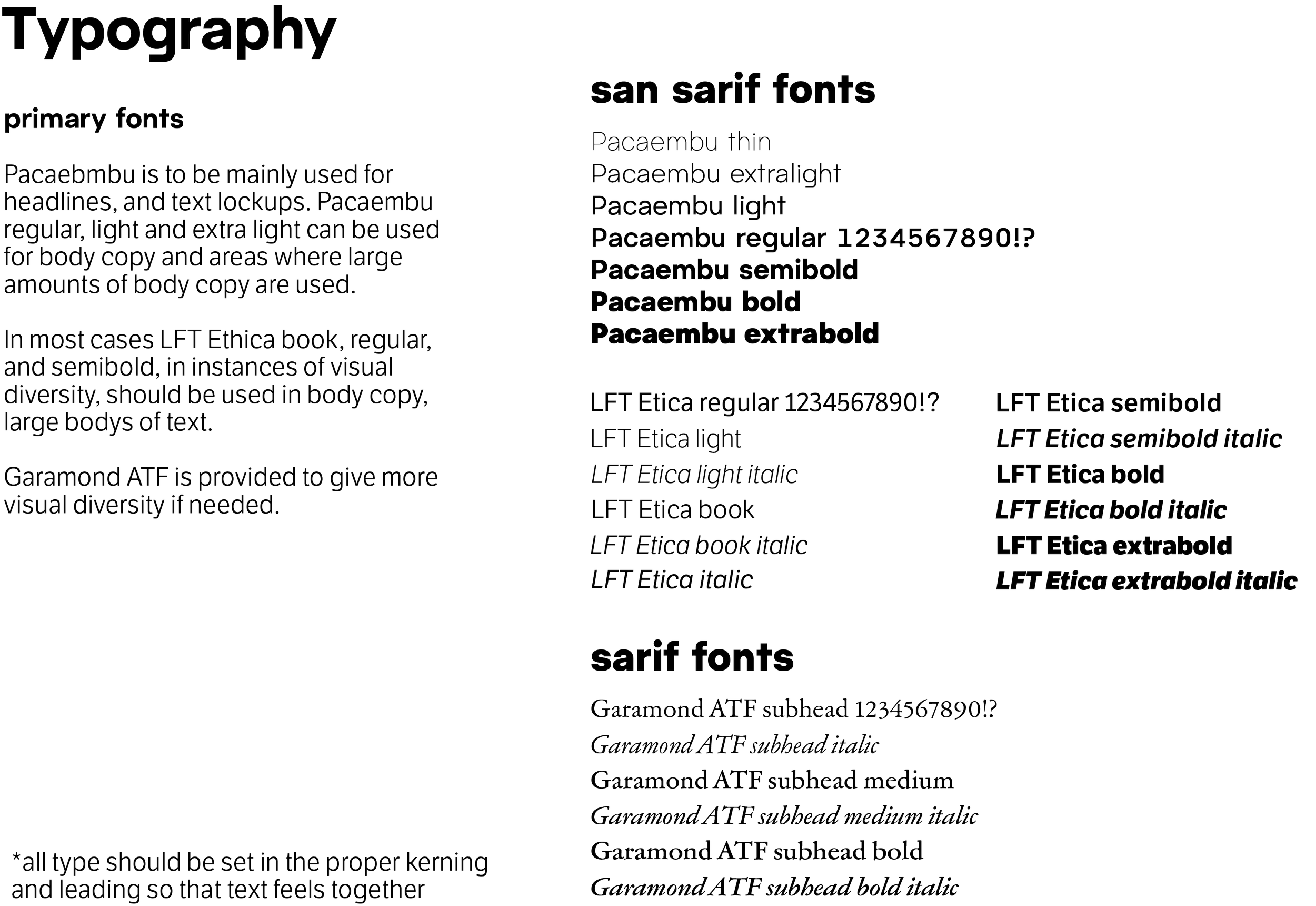
This project felt especially personal to me as the daughter of an immigrant family who grew up in Philadelphia. From the outset, I aimed to capture the city’s unmistakable grit—something immediately recognizable to visitors—while also drawing from its rich history and established iconography. My initial concepts explored two distinct yet connected sides of Philadelphia. The first embraced a more artistic, raw character, with the “H” inspired by the silhouette of a historic Philadelphia rowhome. The second concept paid homage to the city’s legacy in printing and postage, referencing its deep roots in communication and industry. I ultimately chose the Liberty Bell as the central icon, as it remains one of the most instantly recognizable symbols of Philadelphia for tourists and residents alike.
design option 1

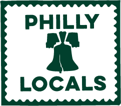
design option 2

The client ultimately selected the second concept as the final logo direction. From there, I refined the identity by pairing modern, clean, and highly legible typefaces with a secondary typeface inspired by early printing styles in Philadelphia. This combination allowed me to reference the city’s historical roots while maintaining a contemporary, versatile system that supports a clear visual hierarchy.
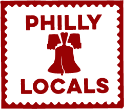
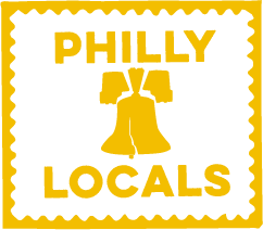
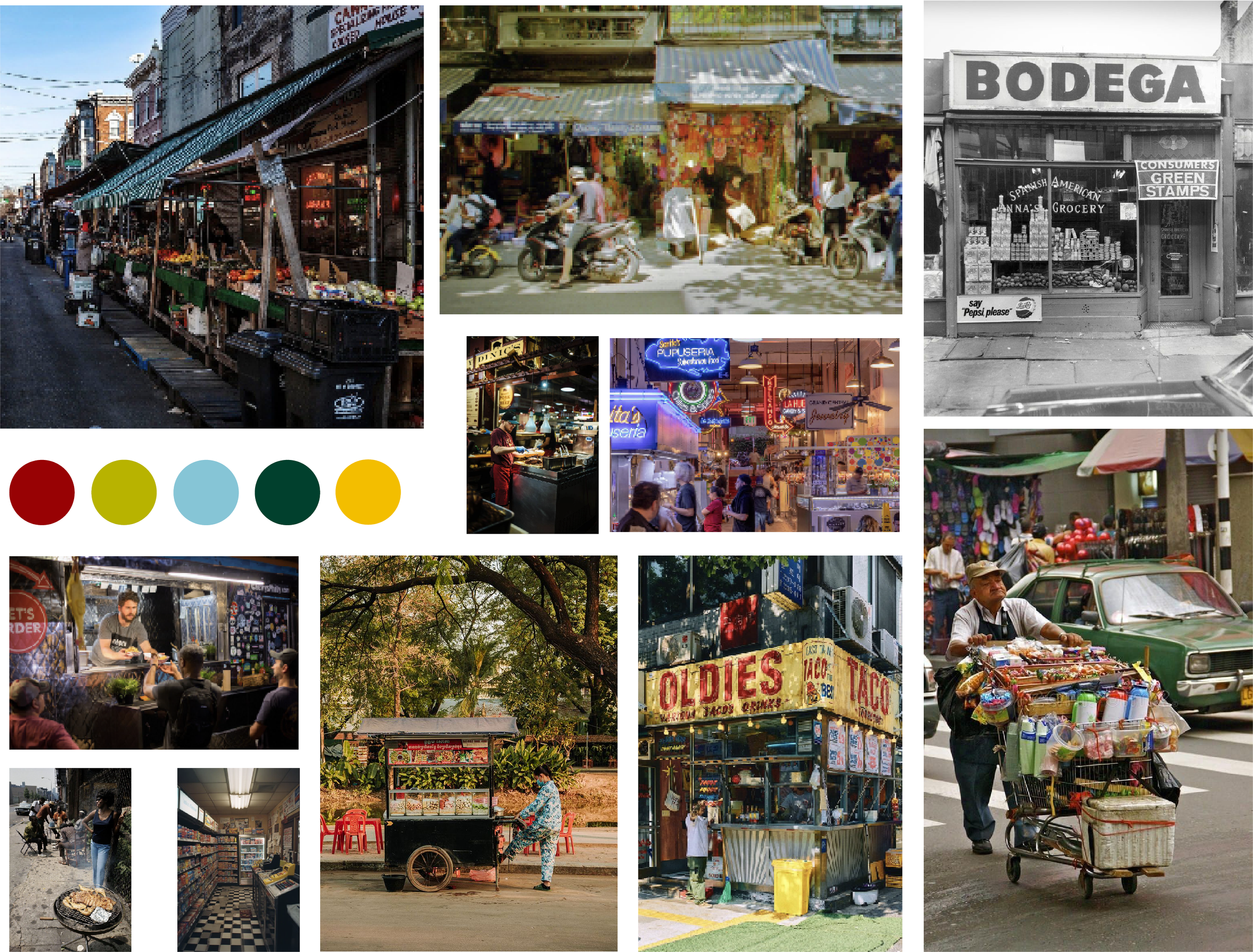
In developing the color palette, I drew inspiration from the bold yet slightly weathered tones often seen in local restaurants and bodegas, as reflected in my mood board. Incorporating multiple colors added vibrancy and energy to the brand, reinforcing its connection to the city’s character while ensuring flexibility across applications.
branding usage
“Their attention to detail and commitment to quality truly stood out. We’ve already recommended them to others.”
— Former Customer