
Pulque
The Tequila Cocktail Set
Pulque is a tequila cocktail set that celebrates the rich history and tradition of tequila. The project takes inspiration from the natural colors found in the tequila-making process, which are used to ground the product and give it an authentic feel.
At the same time, vibrant and bright colors are added to invite the customer into a world of fun and excitement. As a graphic design project, Pulque aims to capture the essence of tequila and present it in a modern and innovative way. Through its bold use of color and attention to detail, Pulque represents a new era of tequila-inspired design.
Design Process
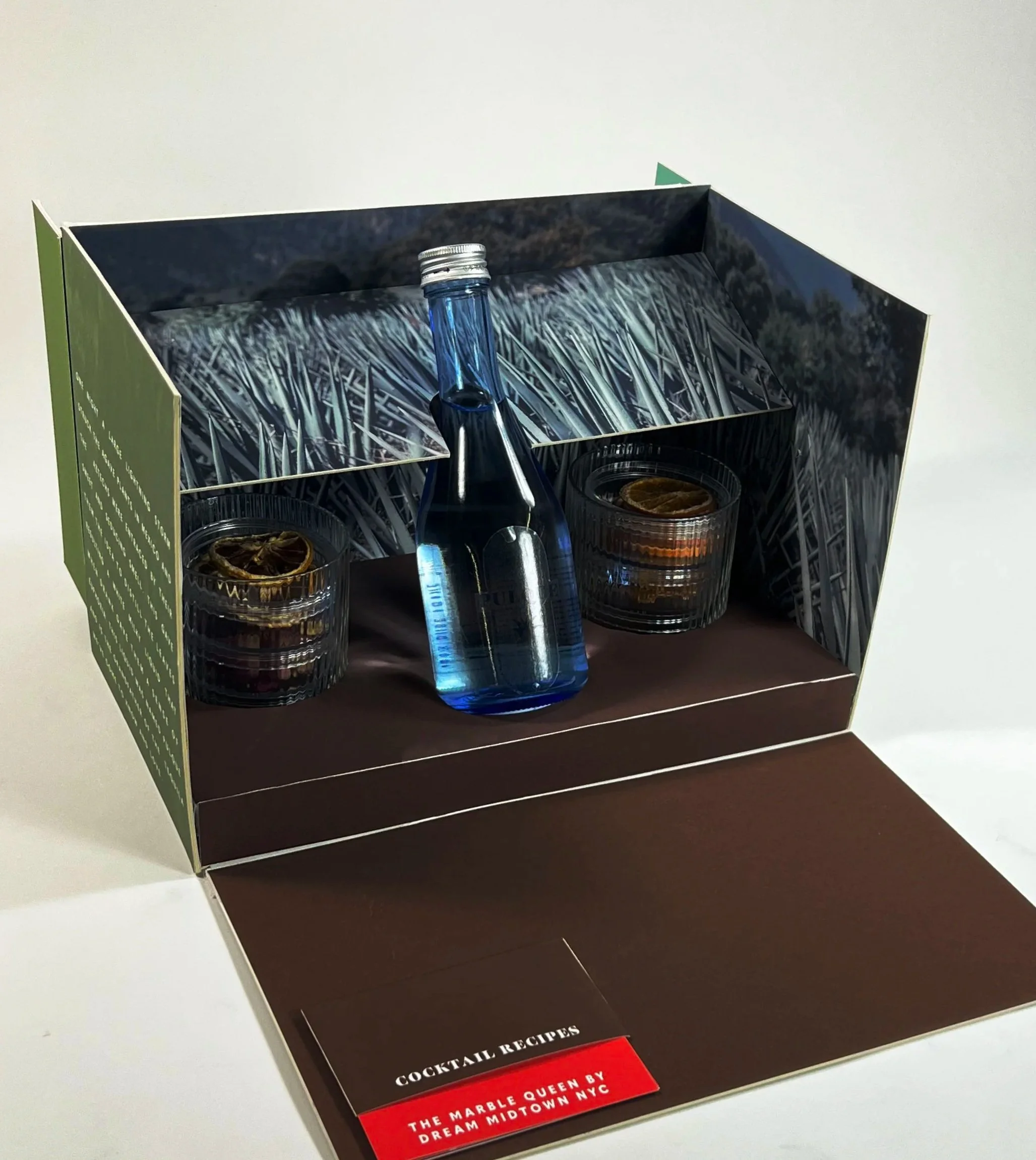
When designing a package that is intended to be a gift, the first initial thought I had in my design process was “what would make someone want to immediately take a photo?” With this question in mind, my solution was to turn the inside of the packaging into a display when opened. This is intended for the reciever of the gift to be able to display in on bar carts, kitchen countertops, and stage their new gift for all of social media to see.
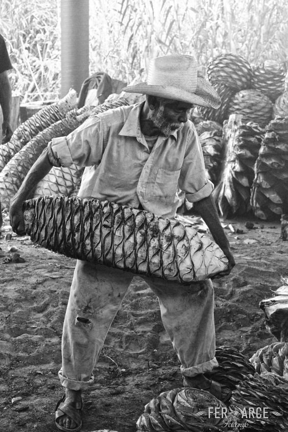
Another question in mind was how do I, as a designer and not someone who may be culturally educated in the history of tequila or mexican culture represent something without turning it into appropriation? with this I took the time to do the research. I spent 25% of the time on this project learning about the culutral lore, the farming, distilling, and bottling that makes tequila what it is, hence naming this project “Pulque”. The name pulque comes from the first versions of tequla that were often white and not clear like we know it today. Featured on the side of the packaging as well is the folk lore about how the God’s gifted this drink to the mexican people.


Mood Board
*
Mood Board *
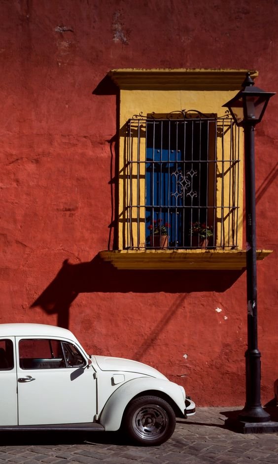
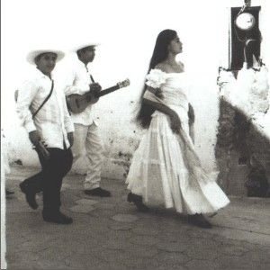
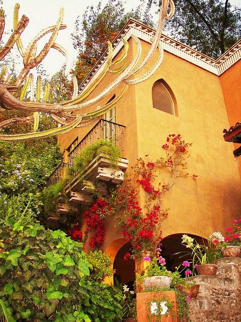
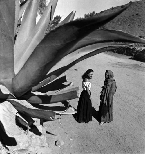
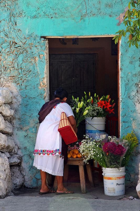
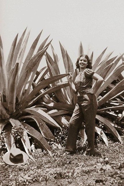
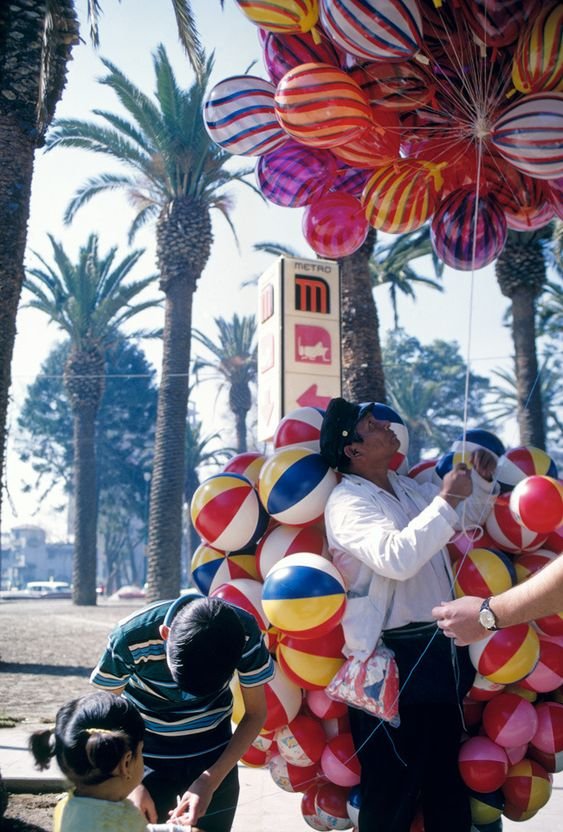
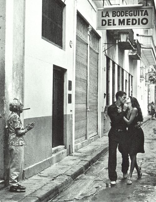
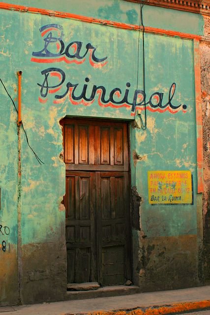
Another large part of my research in creating the logo and picking out colors was looking at historical photos of the environment. When looking at these photos, I loved the earthy but vibrant hues. The greens, oranges, and reds were all an inspiration for the colors of the packaging. I wanted to focus the greens and earth tones to the box because the agave plant that tequila is made of comes from the ground, hence the brown base. I was then able to create a focal point of color on the recipe cards that were pulled from modern-day bars around the country.